Guangzhou Restaurant Branding and Design
Comprehensive Upgrade from Store Space to Visual Identity System
Project Name Guangzhou Restaurant · Tianzi Wharf Store
Project Type Branding and Design
Project Area -
Completion Date 2018
Guangzhou Restaurant was founded in 1935 and is one of the oldest in
Guangzhou. Guangzhou Restaurant has created countless wonderful and splendid by
its carrying culture, the guardian's inheritance, has become a symbol of local
feelings and rolling shutters in Guangfu people. In addition to the completion
of the upgrade of the brand's visual identification system , Guangzhou
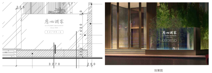
Restaurant also opened a new restaurant with new brand identity in the same year
at Guangzhou Tianzi Wharf.

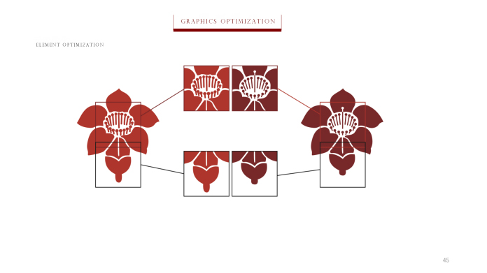
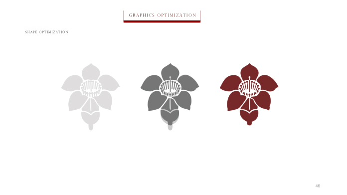
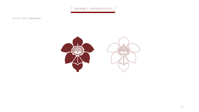
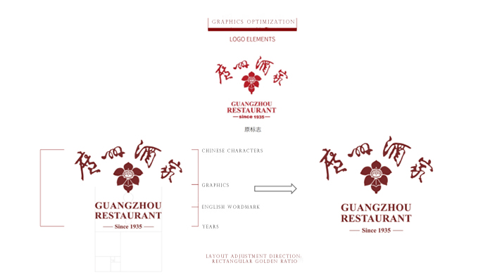
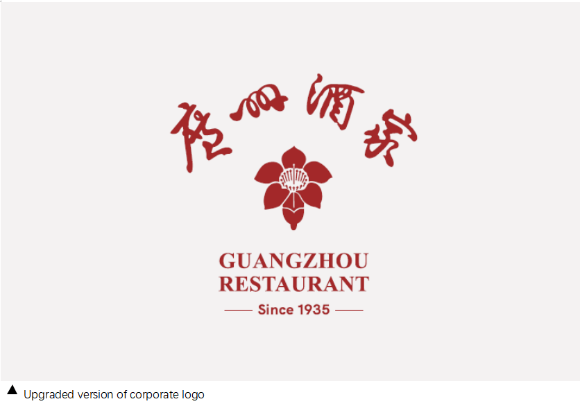
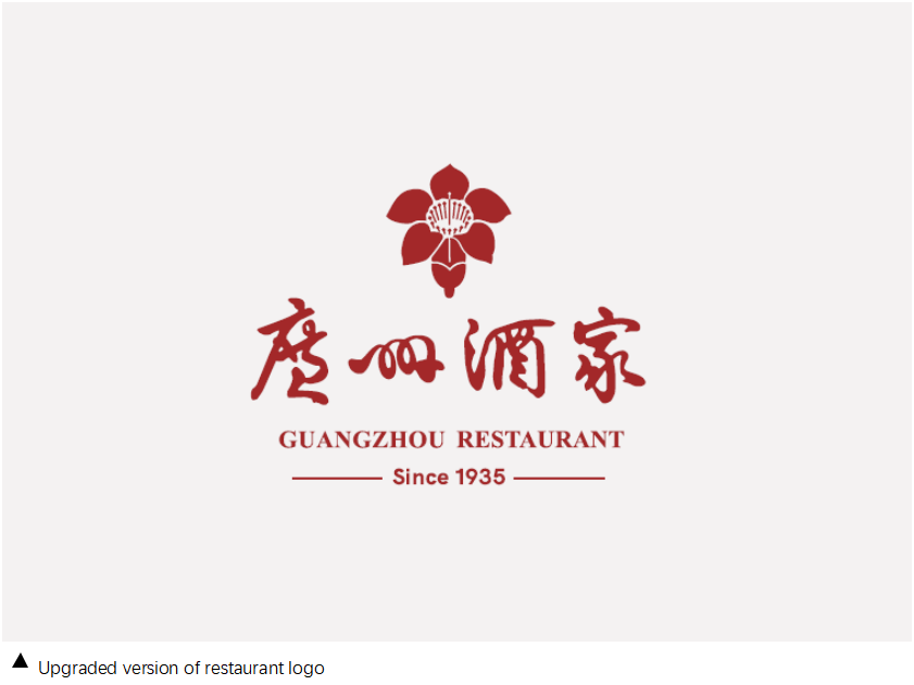
The color of the Guangzhou restaurant brand has undergone a bold upgrade. From the traditional red to the current deep red, in addition to inheriting a long-established culture, it has also increased the brand's calmness and classy image .

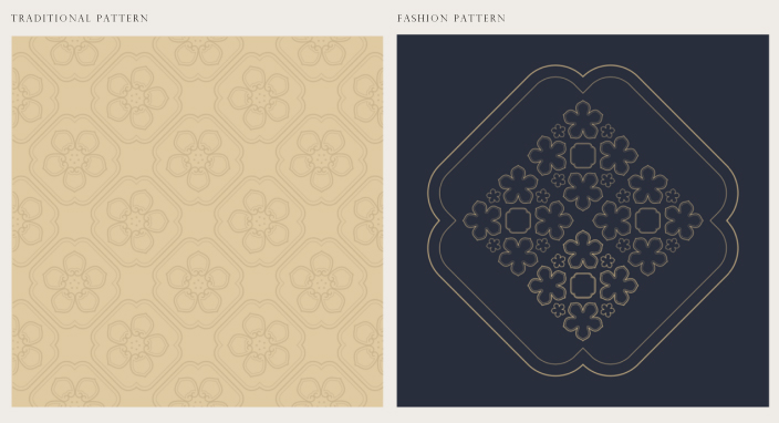
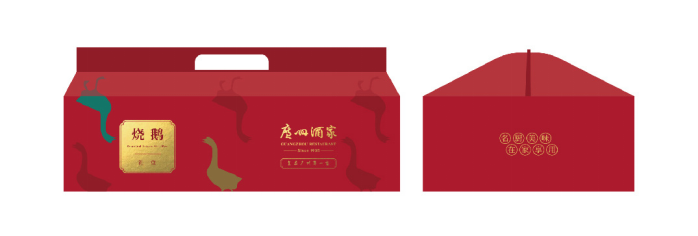
The vibrant of kapok petals inspired the designer to create a series of elegant and exquisite patterns for packaging and other material design.


Kapok plays an important role of visual element of the Guangzhou Restaurant brand identity and identification system, and it is also a representative flower in Guangzhou. Kapok red has a natural joy and blends with the spirit of openness and harmony in the context of Guangfu.
The designer created a set of illustrations based on the different degrees of openness and different growth postures of kapok, to represent the different stage of Guangzhou Restaurant.


Red kapok stands for festive and prosperous in Guangfu family. It also becomes the blueprint behind the Window Design for Guangzhou Restaurant project opened in Tianzi Wharf.
In addition to the traditional dark red, a modern yet elegant dark blue has been added as the main color of Guangzhou Restaurant in Tianzi Wharf.

