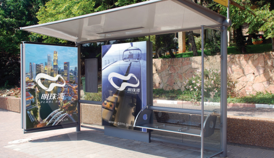
City Branding Design of Pearl Bay, Nansha, Guangzhou
Project Name City Branding of Pearl Bay, Nansha District, Guangzhou
Project Type City Branding and Design
Project Area -
Completion Date 2017
City brand is a geographical name that reflects the personality and value of a city.
City branding is also a symbol that integrates the elements of regional
politics, economy, nature, culture, science and education, etc. In addition, it
is a kind of urban audience's unique personality of the city Comprehensive
impression and psychological perception are the combination of city logo, city
image and city relationship. City branding is a physical resource and intangible
asset of a city. An excellent city brand is like a harmonious and beautiful
song, which can coordinate the noise and lead the voice.
Demonstrate the integrity, consistency, and uniqueness of the region's characteristics.
Pearl Bay Introduction:
As the new district center of Nansha District, Pearl Bay will be built into a national-level new district serving the Mainland, linking Hong Kong and Macau, and facing the world’s comprehensive cooperation between Guangdong, Hong Kong and Macau.

Pearl Bay terrain four main zones: horizontal Lek , Mountain Island tip tour , Pearl River East tour , Hui Valley tour , Lair North tour .
Brand Concept
By sorting out the value of the Nansha Pearl Bay Project , we have extracted 4 keywords: mountain, water, city, and bay.
The Nansha District, connected by mountains and rivers, sits on three banks, six banks and Wushuihui Bay. It is also a smart and diverse coastal port city, which is both the gate of the South China Sea and the gateway to Guangzhou.
To this end, we have established a brand positioning project: Pearl Bay - built dream home built · glamor waterfront
Logo design
As a new urban area, we have increased the design of the glyphs of the three characters of the Pearl Bay, increasing the vivid and vibrant image of the glyphs, and combining them with graphics to form the standard logo.

Graphic design inspired by topographical features Pearl Bay refining, then followed Mingzhu WAN English word the first letter " M , W "


We have set five major brand colors for Pearl Bay as the main identification image of the brand design to present Pearl Bay.


